
Aiming to be the first AAA accessible website in North America, we created a patient-first experience that is inclusive and informative, setting a new bar for usability and accessibility.
An inclusive digital experience.
DELIVERABLESWebsite Redesign
UX/UI Design
User Testing
Rapid Prototyping
Style Guide
Component Library
TIME ON ACCOUNT2 years
CLIENTSpaulding Rehabilitation Network
AGENCYHero Digital
About the client.
Spaulding is a recognized leader in rehabilitative medicine nationally, internationally. They offer inpatient and outpatient care through a network of 4 inpatient facilities and over 25 outpatient centers located throughout Eastern Massachusetts. Their mission is to provide exceptional clinical care, promote medical education, and advance research in rehabilitation medicine.
To achieve success, not only did we need to thoroughly understand the needs of their patients, but also the complexities of the interworking of their care network. Our goal in achieving the highest accessibility level possible, was to ensure that all people can navigate and use the website, regardless of their ability.
My role.
I led the designs from a stage of divulgence to convergence, through completion of development. I worked closely with UX, FED and BA to develop an accessible, functional and visually interesting website design.
A Patient-First Approach.
Throughout the design process, it was extremely important to always consider our varying patient audiences. Our goal throughout this project was to improve website usability and accessibility for the wide range of user abilities and needs. Thinking about these personas, having them printed out and highlighted on my wall, made this project heartfelt, sincere, and extra meaningful.
Facing project challenges.
Brand and print collateral assessment.
The fundamental Spaulding brand was problematic when it came to color transparency and accessibility.
AA vs AAA.
The past primary blue and yellow brand color, the“brand box” element, and secondary color palette did not pass accessibility standards according to the Center for Persons with Disabilities.
Physical and digital disconnect.
The beautiful architecture and environmental influences that make Spaulding special were not translated into the digital experience.
Finding solutions.
Expanding and optimizing the brand color palette.
We added a spectrum of cool hues into the existing brand palette to accommodate contrast ratio requirements for AAA accessibility on the digital experience.
Patterns.
We created a variety of patterns, overlapping shapes, and blue color ways to create visual interest in our component library and design system.
Custom hover and focus states.
I designed custom hover and focus states for every single element of the website, because our new blue palette did not provide enough contrast with the typical default blue focus state.
Designing for all people.
Designing a transformative and inclusive digital experience.
After
Before
The experience.


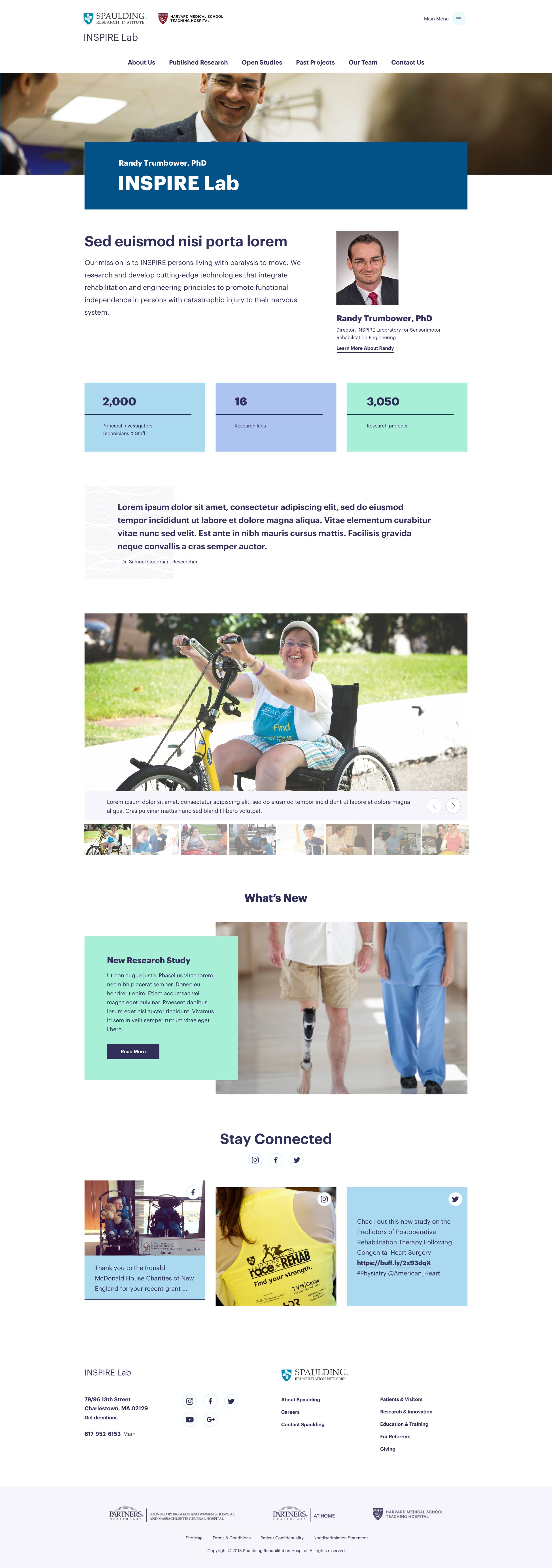
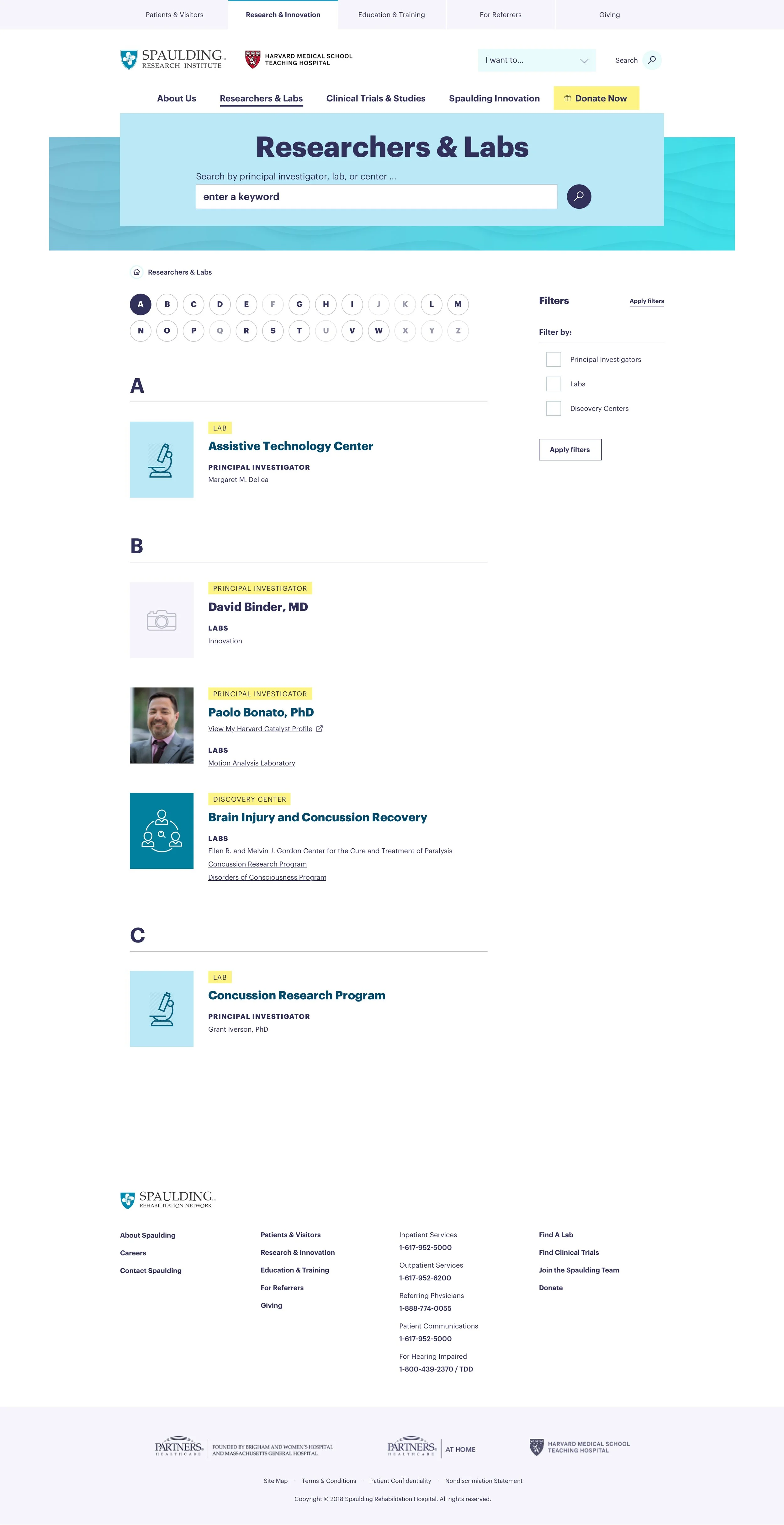

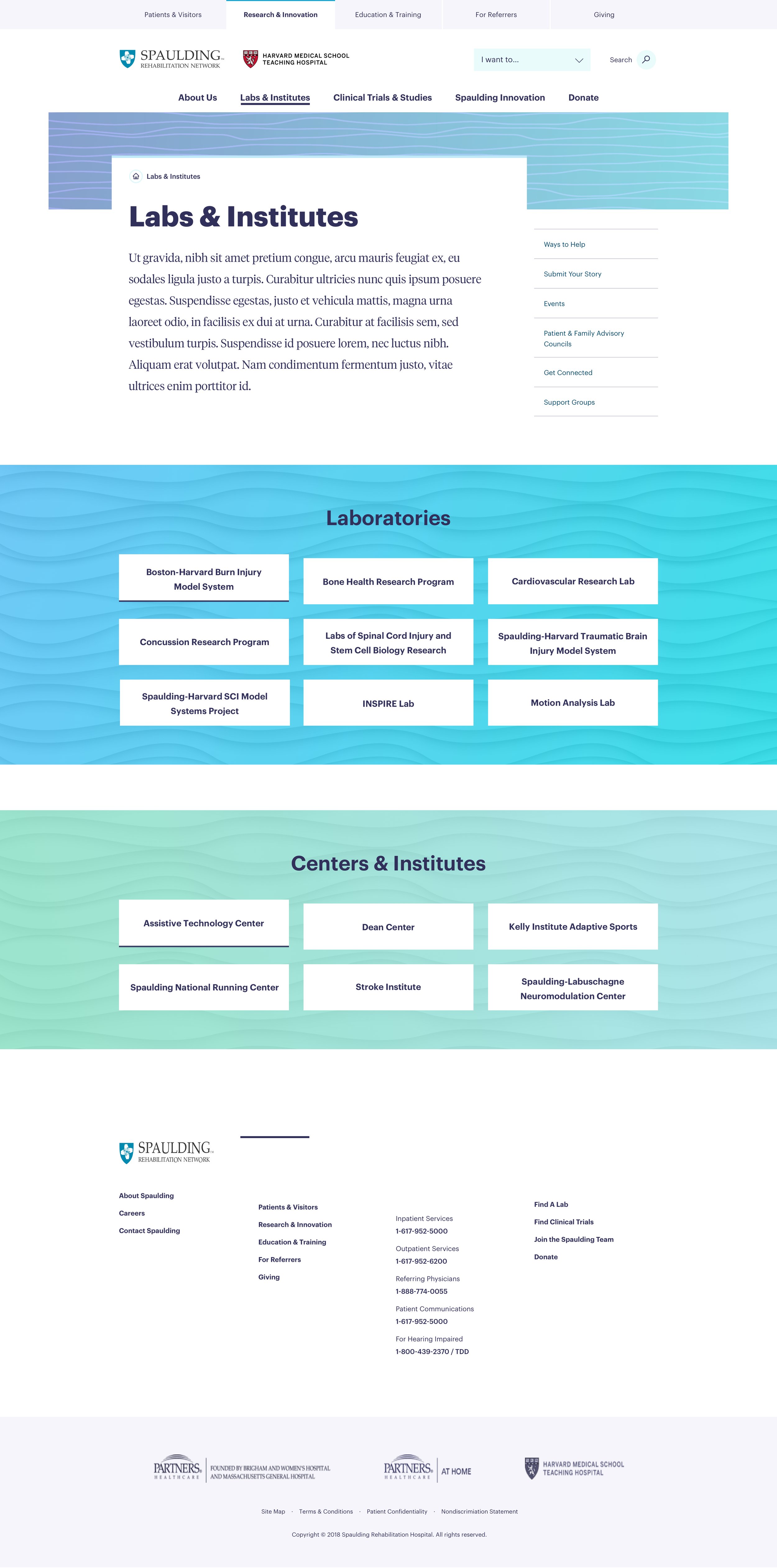
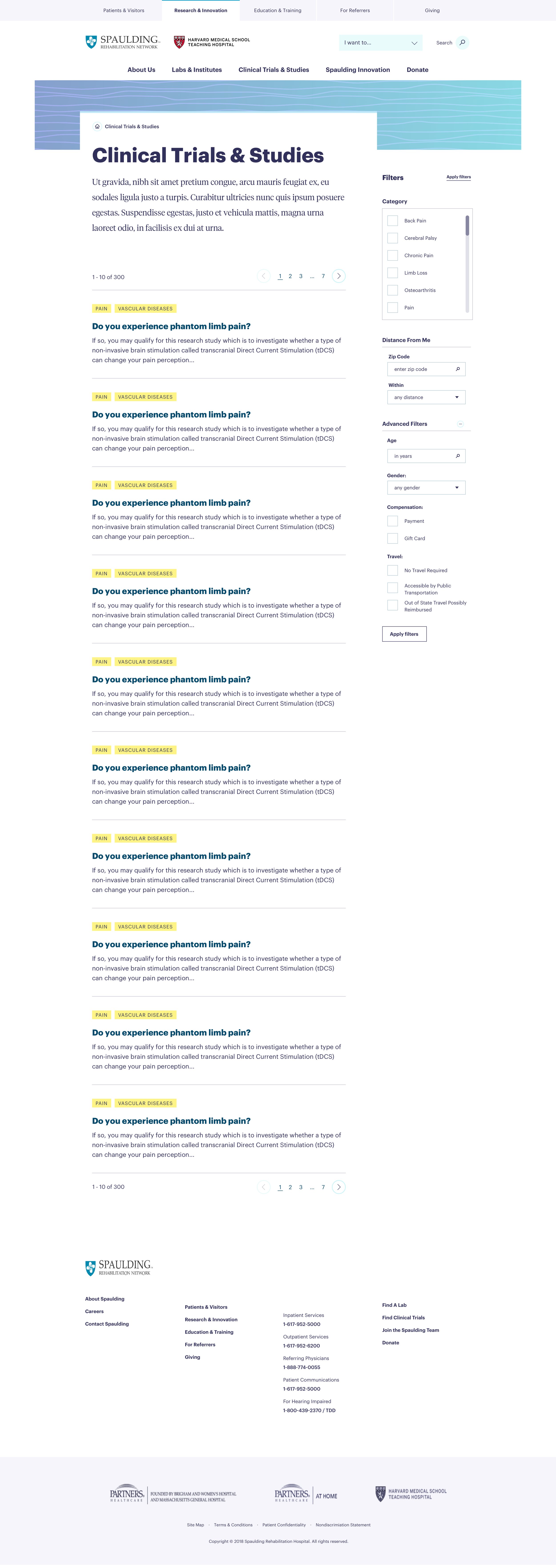


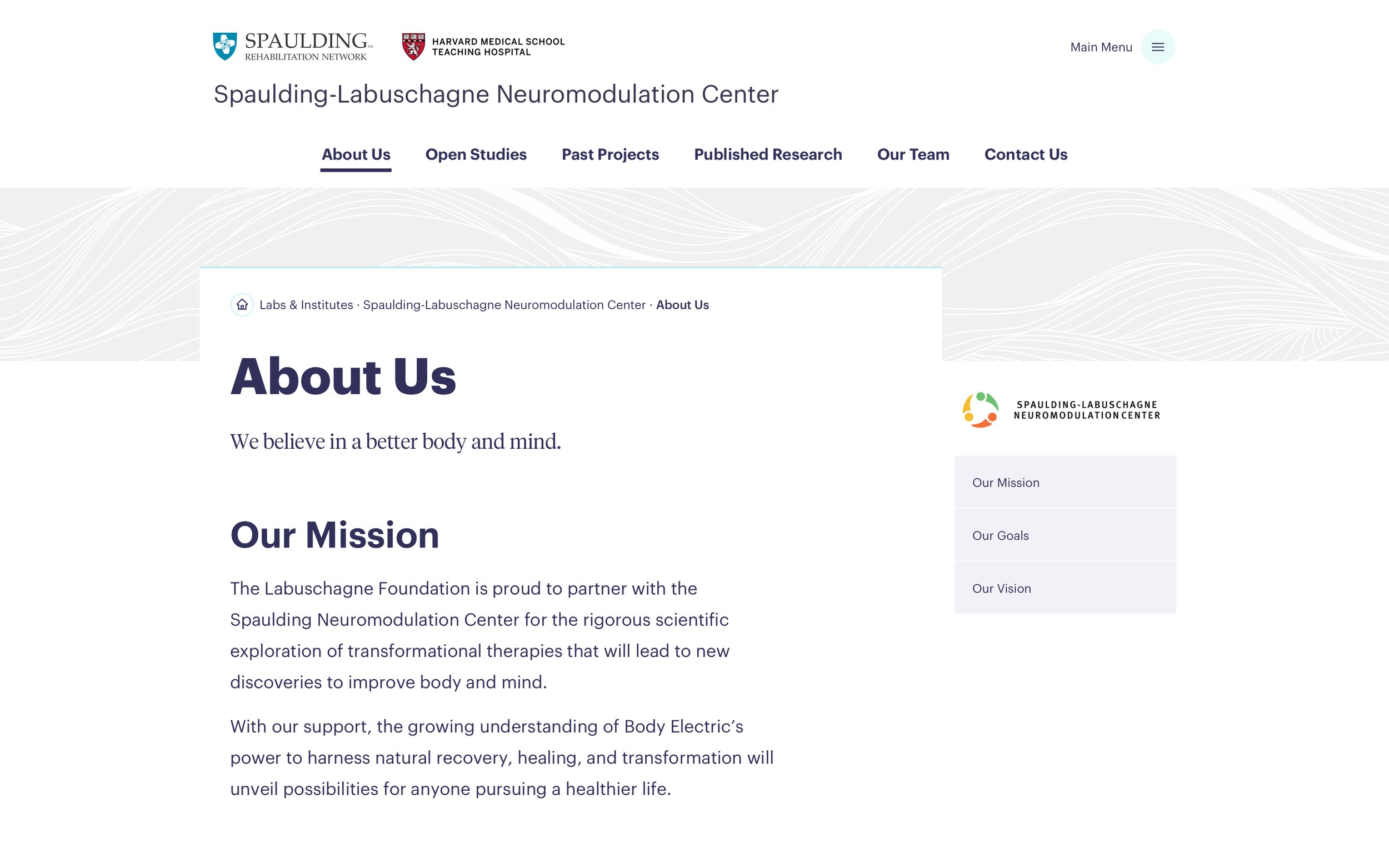
The Style Guide and Component Libraries.


RESULTSWhat’s good for people is good for business.
Since implementing these changes, Spaulding has seen +43% increase in engagement when searching for a physician and a +25% increase while searching for services.


